

When your conversion rates have been stagnating or even declining for a long period, it might be time to change something. Andre Oentoro, the founder of Breadnbeyond, tells how to understand when Is the Best Time for a Landing Page Redesign. You’ll get insights into some factors that make your landing pages don’t convert like they used to.
Landing pages are one of the most crucial pages on your website. These are where a visitor is only a few clicks away from converting, becoming leads, or even paying customers.
You might optimize the SEO, improve your link-building strategy, and perform the A/B testing on those landing pages. But, the effort shouldn’t stop there. They also need to be well-monitored, well-designed, and up-to-date.
Having old-looking, outdated landing pages that have endless forms to fill is a quick way to scare your potential customers. Not to mention it can harm your brand reputation. So, when you think that your landing pages don’t convert like the way they did before, it may be time to redesign them.
We’ll break down some often-overlooked signs that your landing pages need a new, fresh-looking design.
What Does It Means By ‘Redesign’?
First thing first. It’s about a quick bit of semantics to make sure that we’re on the same page. What doesn’t it mean to give a landing page a redesign? Is it an update? Or is it more optimization?
A redesign usually means a change in the overall look and feel of the page. The goal is to create something that looks fresh, new, and catches people’s attention. It should still have the same purpose as before — to convert visitors into leads or customers — but with an updated design. For example, a new visual identity for your company might prompt you to give your website a redesign. This would include changes to the color scheme, typography, and imagery used on the site.
Redesigning also includes restructuring UI/UX to incorporate a more easy-to-navigate feel. The information architecture also gets reconsidered to make it easier for people to find what they need on your site. All of these changes go live around the same time.
A low conversion rate is an obvious reason for wanting a landing page to revamp. But, some other factors are lurking beneath the surface. Here are some other common signs that it’s time for a change:
Sign #1. Your Landing Pages Aren’t Mobile-Friendly
Do you know that more than half of all web traffic comes from mobile devices?
If your website as a whole isn’t mobile-friendly, that’s a bigger issue to deal with. But, if your landing pages specifically aren’t playing nice on mobile devices, it’s time for a change.
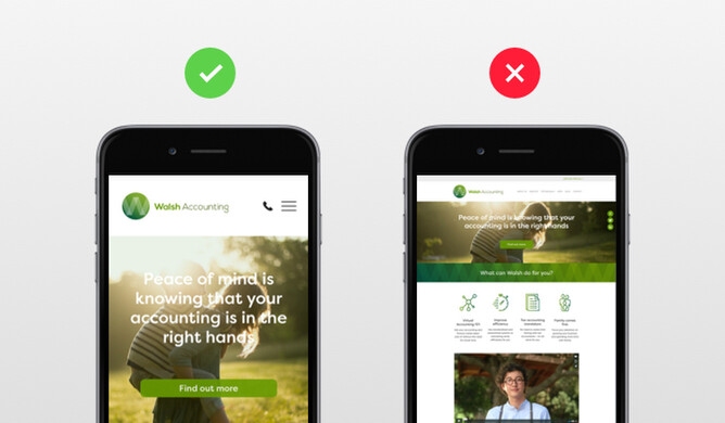
People are impatient. They want what they want when they want it. If they have to pinch and zoom their way around your landing page, they’ll give up and leave in seconds.
Sign #2. The Forms Are Outdated
The forms on your landing pages are critical. They’re how you collect information from potential leads so you can nurture them into paying customers.
But, if your forms are outdated, they’re not going to be very effective. It makes sense if potential customers are scared to give away their information.
Think about it — would you want to fill out a form that asks for information that isn’t relevant anymore? Or one that looks like it was made in the early 2000s?
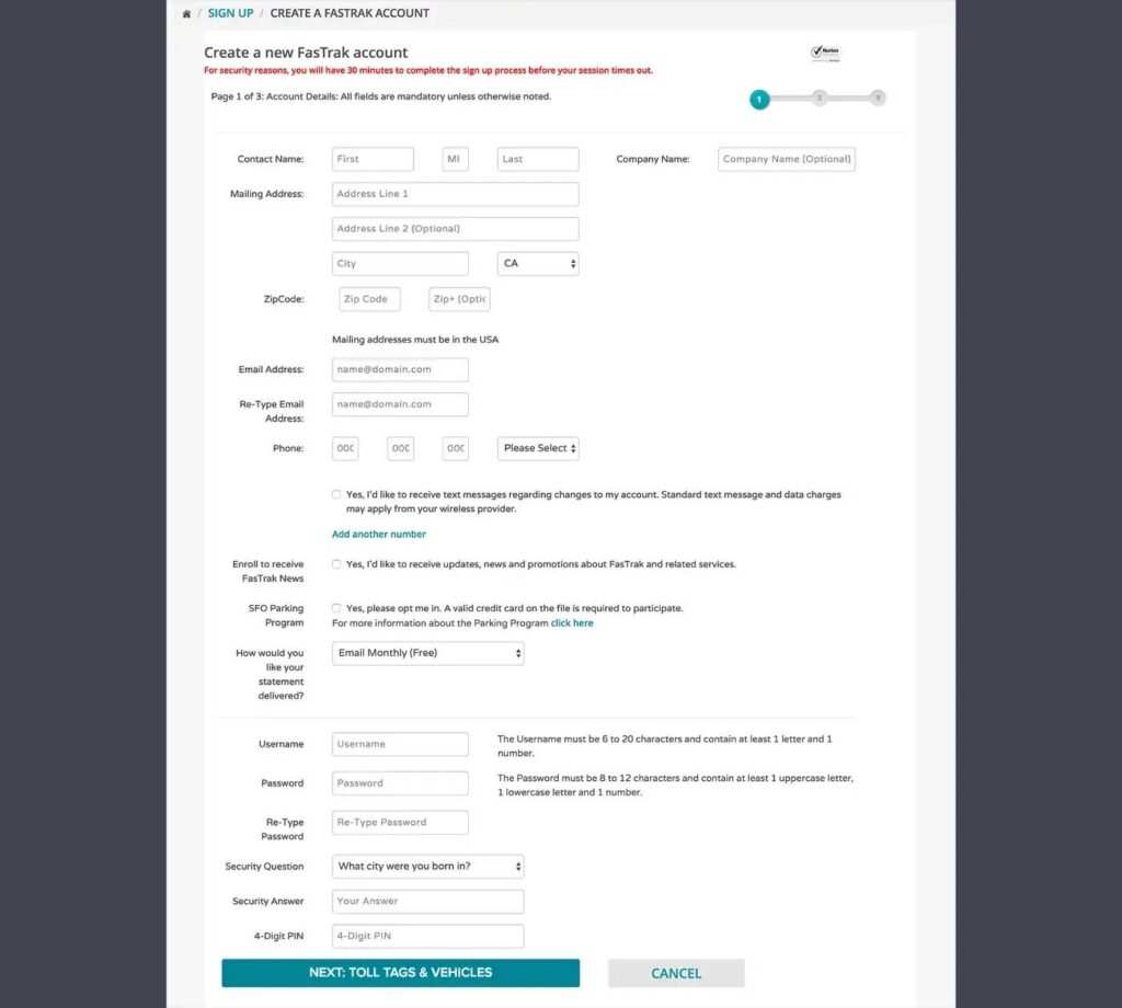
If you answered “no” to either of those questions, your leads probably feel the same way.
Here are a few quick forms fixes that can make a big difference:
- Get rid of any information that isn’t absolutely necessary.
- Use short, concise field labels that are easy to understand.
- Incorporate conditional logic, so people only see relevant fields.
- Use a modern form builder, so your forms look great on all devices.
Sign #3. Your Landing Pages No Longer Match Your Current Branding
Your brand is constantly evolving. As your business grows, your target audience changes, and you might even change your mission or values. All of these factors contribute to how you position your brand in the market. And, as your branding changes, so should your website — including your landing pages. If your current landing pages don’t reflect your new branding, it’s time for a change.
Need help determining if your landing pages match your current branding? Here are a few quick things to check:
- Are the colors on your landing pages still in line with your brand palette?
- Does the copy reflect your new tone and voice?
- Is the copy relevant to your current target customers?
- Is the overall look and feel still on brand?
If you answered “no” to any of these questions, it might be time for a redesign.
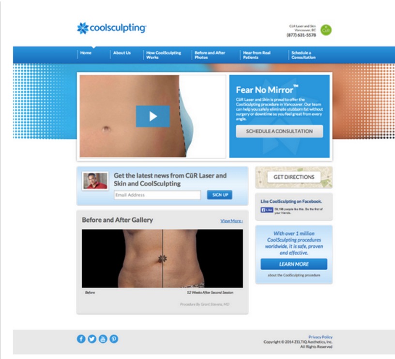
Sign #4. Not Enough Visuals
Bulky paragraphs seem like a chore to read. And, let’s be honest—most people won’t even bother.
Incorporating more visuals into your design can help break up the text, making it more digestible for your readers. People want visual content. In fact, articles with images get 94% more views than those without.
So, if you want people actually to read your landing pages, you need to incorporate more visuals. This could mean adding things like infographics, explainer videos, illustrations, or images to break up the text. You can also consider embedding your social media videos.
Sign #5. You’re Being So Left Behind
In this fast-paced marketing field, your competitors leave no stone unturned when it comes to their website design and functionality. If you don’t keep up, you’ll quickly fall behind — and it will show on your landing pages.
To avoid being left in the dust, it’s important to keep an eye on your competition. Take some time periodically to check out their websites and see what they’re doing. If you see something that looks new and different, take note. It could be something you want to incorporate into your own design.
Of course, you don’t want to copy your competition outright. But, it is important to stay up-to-date on the latest trends so you can stay ahead of the curve.
Sign #6. There are Too Many CTA Buttons
If there’s one thing that should be crystal clear on your landing pages, it’s what you want people to do. And, unfortunately, too many CTA buttons can actually make that more confusing for potential leads.
When someone lands on your page, they should immediately know what their next step is. If there are too many options, they might get overwhelmed and just leave.
To avoid this, limit the number of CTA buttons on each page. And, make sure they’re all clearly labeled, so there’s no confusion about what you want people to do.
Wrapping Up
A well-designed landing page is critical to the success of your inbound marketing efforts. Those pages are often the first interaction someone has with your brand after they click on your ads, so you want to make sure they’re up to par.
If you’ve been noticing any of the signs we listed above, it might be time for a redesign. By making some simple changes, you can improve your conversion rates and better engage your target audience.